 New Set Pieces, Immunity Skill Cooldowns, GR Pylons Not Spawning, Patch 2.2 PTR Impressions
 "Adventure Awaits"
 Closed Beta Test Friend Invites Incoming, Upcoming Mount Changes
![]() Patch 6.1.2 PTR - Build 19711, CC DR Changes, Blue Tweets, Patch 6.1 Known Issues
Patch 6.1.2 PTR - Build 19711, CC DR Changes, Blue Tweets, Patch 6.1 Known Issues
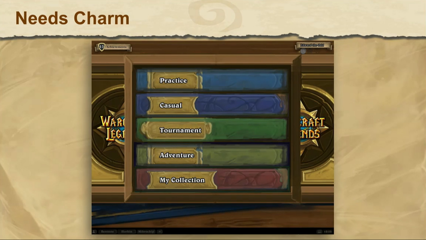
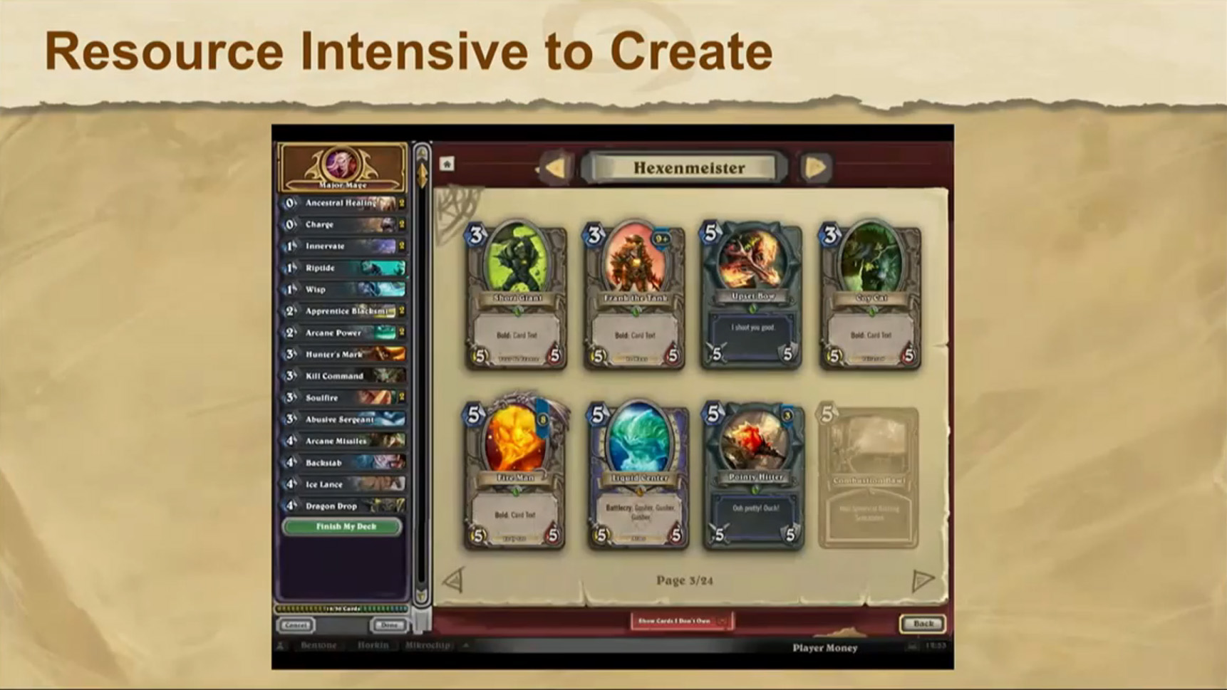
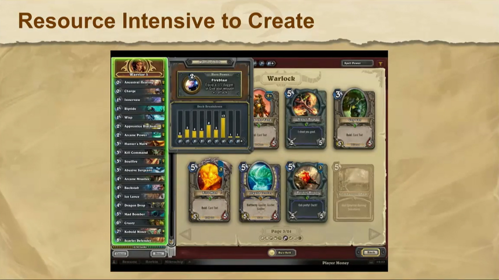
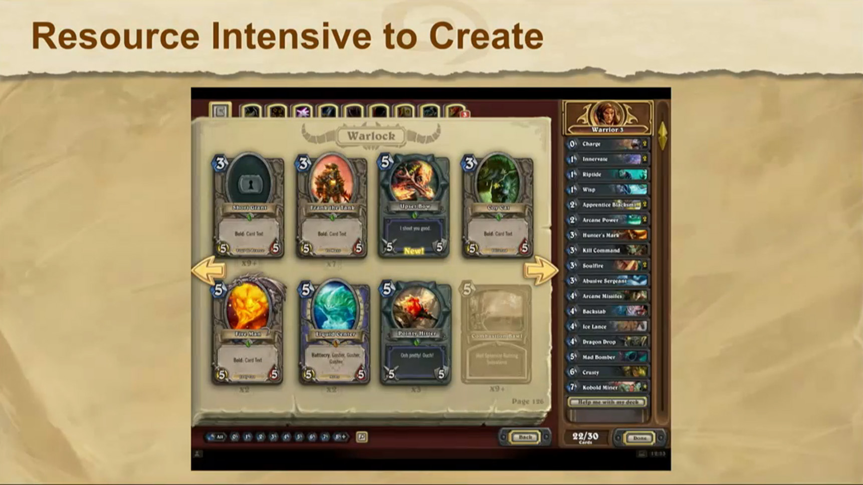
Hearthstone UI Through the Years - GDC 2015
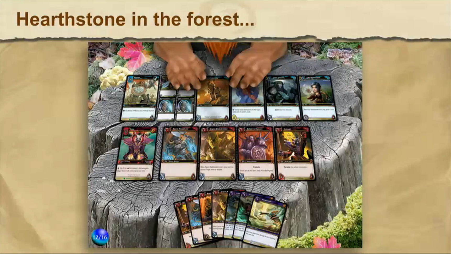
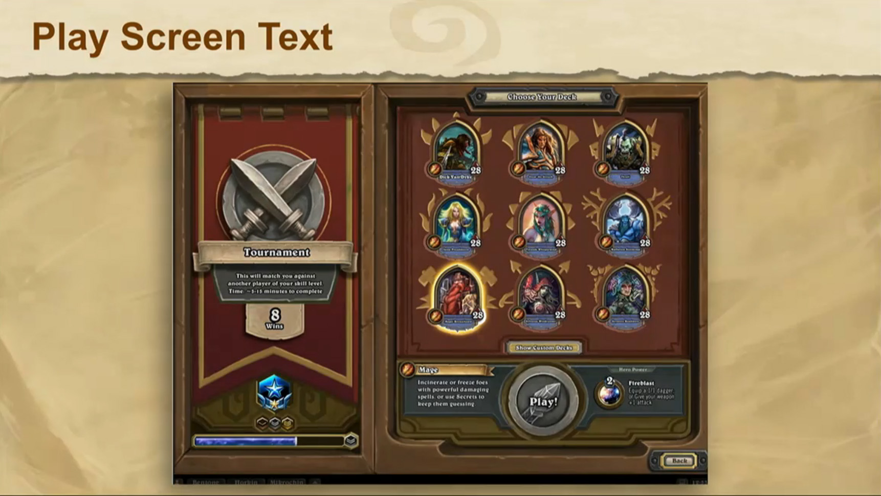
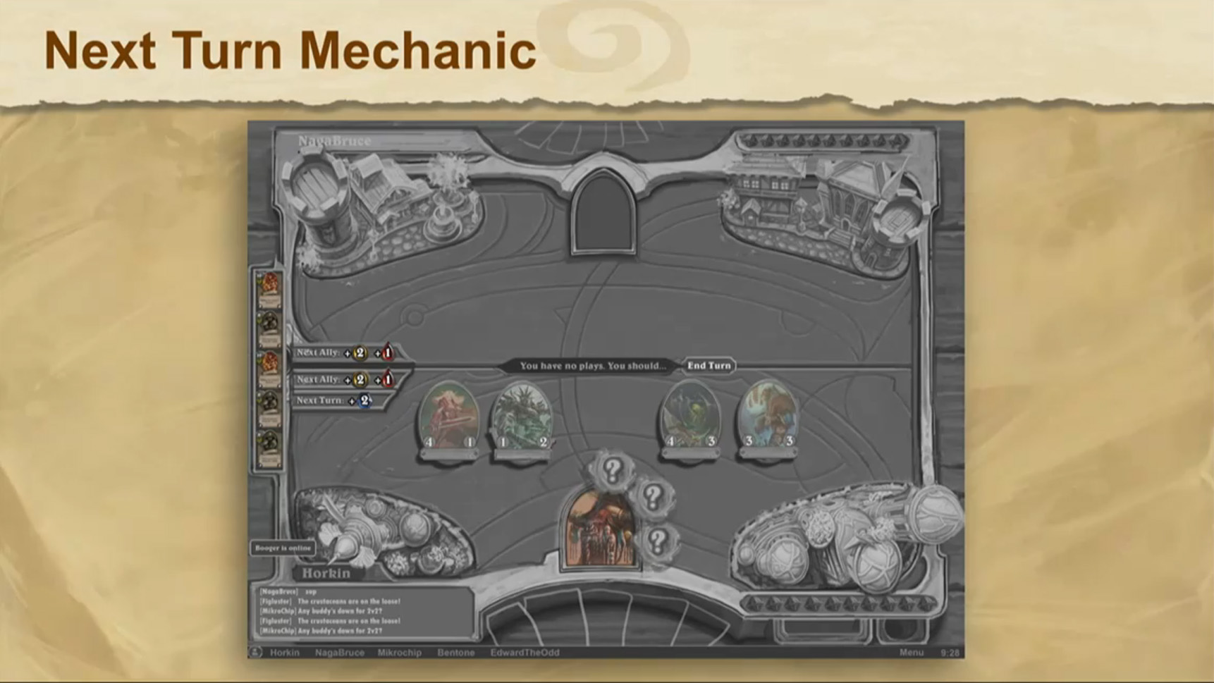
Hearthstone's Senior UI Designer, Derek "Figluster" Sakamoto, spoke talked about Hearthstone's UI design in a panel today at GDC 2015 and showed plenty of screenshots of Hearthstone's interface through the years, and how they go through the design of the interface, all of which we've got below in a gallery.
Here are some interesting bits from the talk. If you want to see the entire thing, Gamespot has has a recording.
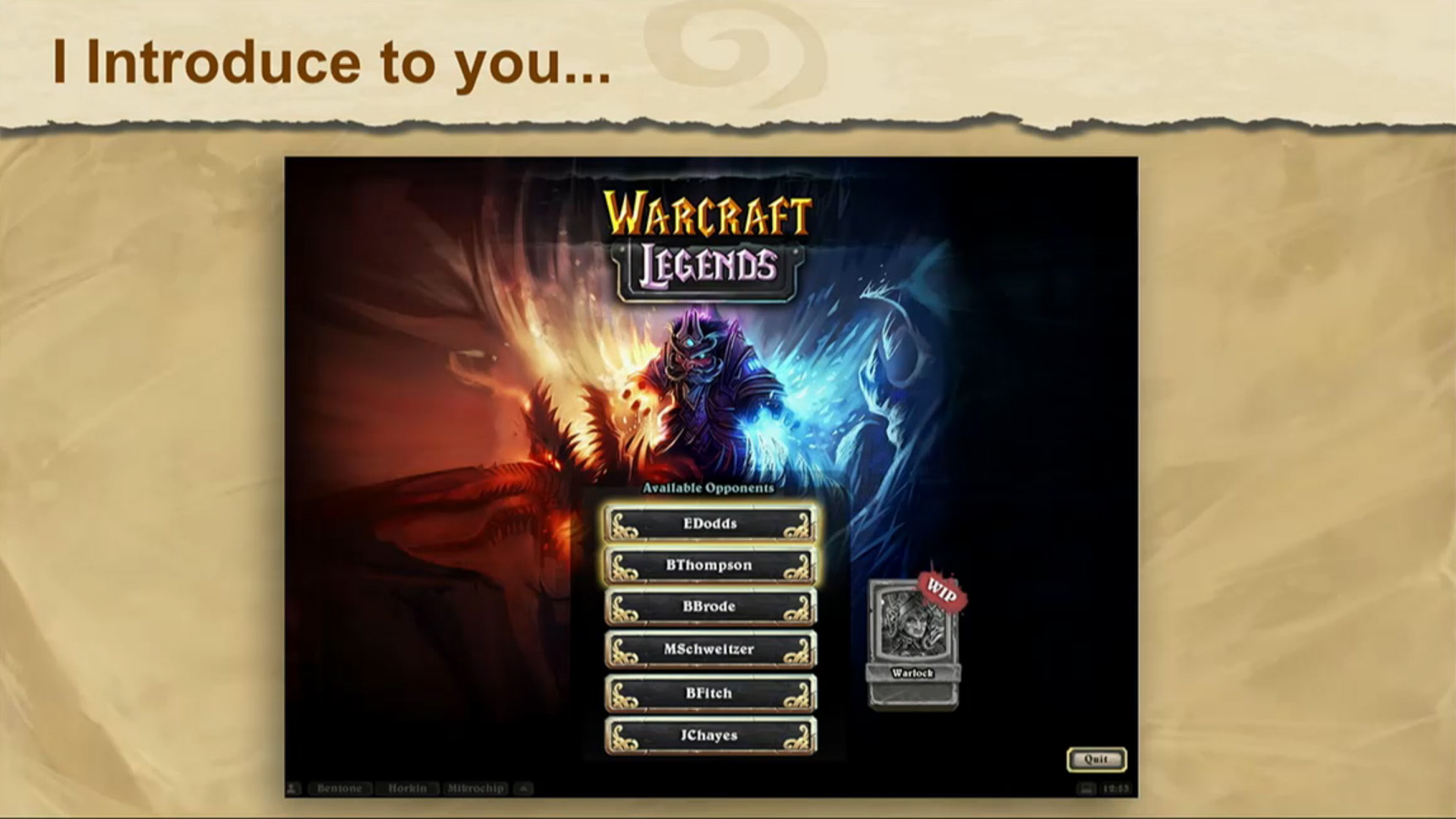
- Hearthstone got the greenlight at Blizzard under the title Warcraft Legends: Fire and Ice.
- The initial prototype of Hearthstone used Adobe Flash.
- Originally there was this idea that you would travel across the map of Azeroth, unlocking new regions while completing quests.
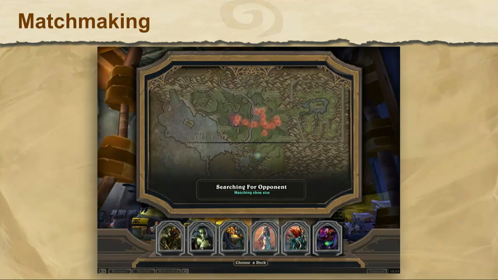
- The matchmaking spinner has gone through a few different lives, including:
- Gurubashi Arena: You see the Heroes of Warcraft flying by until your opponent was found. They'd then drop down into the arena with you.
- Azeroth Map: You would see an overview of Azeroth, and would fly through the overview, seeing other people playing games in "zones". You'd then land in your zone with an opponent waiting for you.
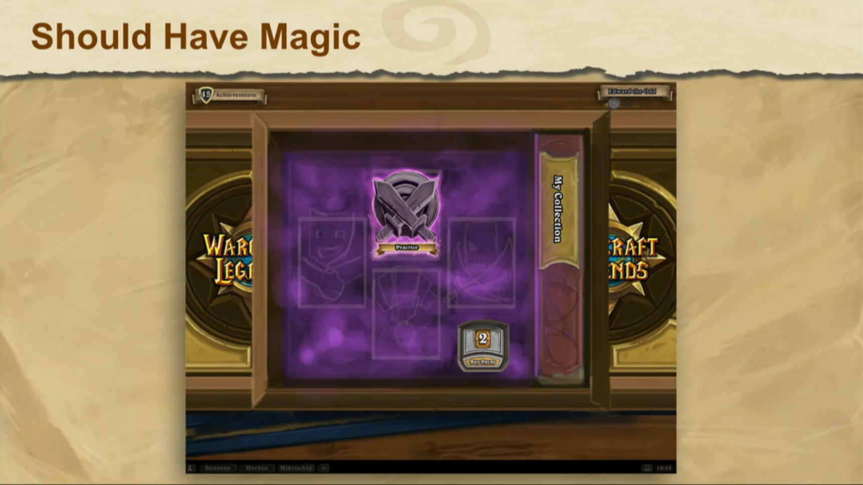
- The Hearthstone Box which we are all familiar with really helped the team design the interface.
- Little trays to keep things organized.
- Keys to unlock precious goods.
- The team designs using flavor over efficiency, although a core value at Blizzard is still Gameplay First, so sometimes compromise is needed.
- Each part of the box needs to feel like its own place.
- Flavor: Not being able to edit your deck on the screen where you choose you hero for the next battle. You need to go to the collection manager for that.
Panel Slide Gallery


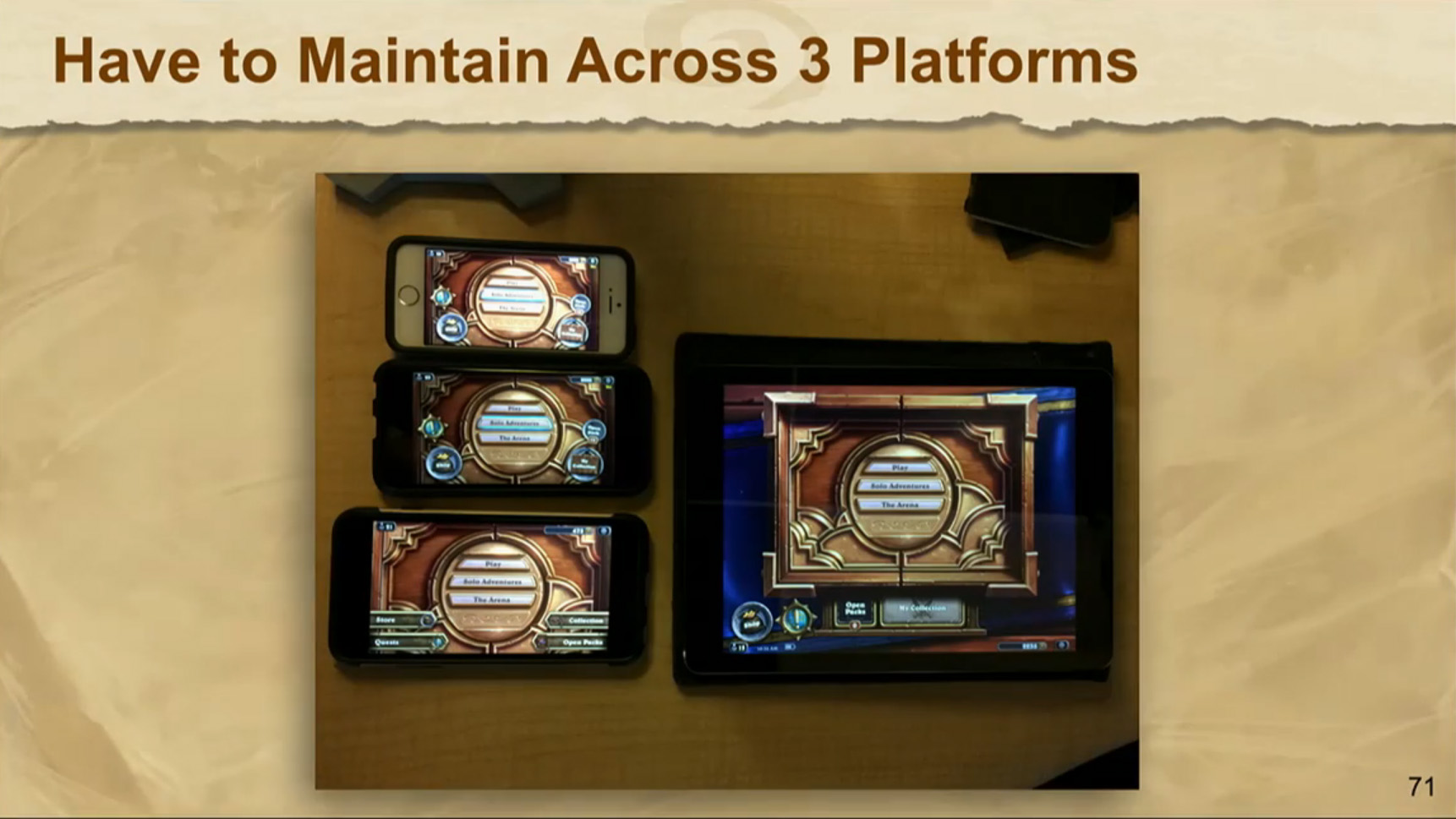
First Look at Hearthstone on Mobile
During the UI panel at GDC 2015, an image appeared with some mobile devices running Hearthstone on them at the beginning screen. It was also stated in the Q&A that we'd see it "in the next a couple of months", and that it was "looking pretty awesome".
Deck Spotlight: Spark's Deadly Tactics
In today's deck spotlight, Spark is back with another one of his Hunter creations, Deadly Tactics, for Season 12! This Hunter deck makes heavy use of the Deathrattle mechanic in association with Feign Death to pull off some crazy good combos which lead to some pretty funny moments.
The deck is vulnerable to aggro decks, so if you're seeing a lot of those where you're at on the ladder, you may want to think again before picking it, but Spark has had plenty of success with it against non-aggro decks! If you're having issues with aggro decks, check out Spark's Snake Bite deck.
At 6800 dust, the deck is a bit on the higher end of the spectrum for crafting, but if you already have Dr. Balance and Sneed's Old Shredder, you're halfway there. Check out Spark's fantastic guide to this deck, or check out the deck below to begin crafting.
|
|
||
|---|---|---|
Minion (23)
|
Ability (5)
|
Weapon (2) |
| Loading Collection | ||
New Forum: Adventures!
In preparation for the upcoming Blackrock Mountain adventure, we've opened up a new forum dedicated to the discussions of adventures.
Go ahead, take yourself on an adventure over to the new forum.


-
View User Profile
-
Send Message
Posted May 8, 2015 (Blackrock Launch)cool!
-
View User Profile
-
Send Message
Posted Mar 10, 2015 (Undertaker Nerf)Always pleasant to see retrospects of the game. Now we know what we have avoided :)
-
View User Profile
-
Send Message
Posted Mar 7, 2015 (Undertaker Nerf)I think Baron Geddon should be have kept the original name of 'Fire Man'.
-
View User Profile
-
Send Message
Posted Mar 5, 2015 (Undertaker Nerf)Blizzard is always good at introducing something cool as a preview and then give us a totally different game (which is not cool at all comparing to the preview)... I'm so disappointed.
-
View User Profile
-
Send Message
Posted Mar 5, 2015 (Undertaker Nerf)I like that description for mage "Incinerate or freeze foes with powerful damaging spells, or use secrets to keep them guessing"
See, that's how mage SHOULD be played, instead we have "Vommit your hand of mechs on the board, then keep spamming them until you win!"
-
View User Profile
-
Send Message
Posted Mar 5, 2015 (Undertaker Nerf)Maybe they should make a Hungry Crab version for Mech?
-
View User Profile
-
Send Message
Posted Mar 5, 2015 (Undertaker Nerf)gief new adventure !
-
View User Profile
-
Send Message
Posted Mar 5, 2015 (Undertaker Nerf)If only frostbolt stayed a 5 cost card. Huehue.
-
View User Profile
-
Send Message
Posted Mar 5, 2015 (Undertaker Nerf)I actually like the old UI better...
-
View User Profile
-
Send Message
Posted Mar 5, 2015 (Undertaker Nerf)All those images should be in an album, so we can next and prev through them. It's super-annoying trying to view them all as individual entities.
-
View User Profile
-
Send Message
Posted Mar 5, 2015 (Undertaker Nerf)Is this better? http://imgur.com/a/WYU5C#0
-
View User Profile
-
Send Message
Posted Mar 5, 2015 (Undertaker Nerf)Yes. Exactly.
-
View User Profile
-
Send Message
Posted Mar 5, 2015 (Undertaker Nerf)Good stuff!
-
View User Profile
-
Send Message
Posted Mar 5, 2015 (Undertaker Nerf)Been playing Hearthstone on my cell phone (Jailbroken iPhone 6+),best thing to ever happen!
-
View User Profile
-
Send Message
Posted Mar 5, 2015 (Undertaker Nerf)Phones in a couple of months! #HYPE
-
View User Profile
-
Send Message
Posted Mar 5, 2015 (Undertaker Nerf)Yeah, I'm going to get fired from work when that happens.
-
View User Profile
-
Send Message
Posted Mar 5, 2015 (Undertaker Nerf)Maybe we gonna see some UI changes in the next patch. Does anyone remember thread about possible changes in collection they think about? They were thinking about to combine casual and golden cards in one slot.
-
View User Profile
-
Send Message
Posted Mar 5, 2015 (Undertaker Nerf)I would rather like to see card back visible in "My Collection".
-
View User Profile
-
Send Message
Posted Mar 5, 2015 (Undertaker Nerf)Me too. With an option to assign a card back to specific decks.
I think that I read that same thing somewhere. It is needed, really.
As a side note, it would be nice to have an option to turn off the gold foil so you could see the class color but keep the larger animated picture.
-
View User Profile
-
Send Message
Posted Mar 5, 2015 (Undertaker Nerf)They really love 5/5 cards. It's nice to see how they were shaping everything and i am happy with the final result. Much better than anything else on the gallery, some of the interface models looks like a browser game. It could be fine, but Hearthstone needed to be something more.